Thursday 13 December 2012

Concept for Landscape

Mio Del Rosario is a concept designer and illustrator currently working at Marvel Animation Studios. Mio has also worked for companies such as Walt Disney Animation Studios, Syfy and Hasbro Animation Studios.

I chose this image because I thought it was captivating. This image is not only beautiful and unique but the image speaks to me - and tells a story of what is happening in the land. However what the story is I feel is different and individual to each person and it is this I love about this amazing piece of art.


6 different 'credit card' ideas

 after asking a few people for their opinions of my quick sketches most agreed on 2 - the second one (the entrance to a city or fortress) and number 5 (the volcano)
From this I will determine which one I like more and which programme to use to complete this piece.
A5 Refined Sketch
For this piece I have decided to do a volcano erupting with a city next to it, with high-walls that would be protected by some-form of magic. The reason for choosing this is because the dark pallet I would have to use would be a challenge along with creating realistic lava. This piece I believe to be tricky but enjoyable.


Part One) As you can see this new sketch is completely different to my initial refined sketch and this is because when I first tried to attempt this I hated the outcome. And so I decided to start anew.
Part Two) because I felt that my sketch was really hard to make out I gave it some basic block colours to distinguish everything and give myself a very rough idea of the colours to use and how it should look.
Part Three) At this point I have just completed the skull rock feature, this was surprisingly tricky, as I initially thought that the eye sockets would just be black, but because of the lava coming out of them it would lighted it all up, illuminating the inside of the sockets and the skull and giving a lot of the skull an orange tint because of the colour coming off of the lava.
Part Four) I have given my staircase leading up to a bridge an outline and started to colour and add effects to make it stand out and look realistic, as you can see I still have my outline as the was crucial to make the stairs look really in the fact they had to have perspective and be neatened up for the time with lines to follow and so using these 'guides' I coloured my stairs.
Part Five) I just finished the stair case and entrance to the skull, initially I felt that the colour was too light and stuck out too much so I darkened them both, and with the use of lighting and shading made them look 3D and the stairs actually look like stairs without the use of outlines which is awesome. I have also added small detail like metal poles where a bridge could have been, but decided not to have one as I prefer it without.
Part Six) For the foreground I started by using the base block colour and used different variations of this colour depending on whether it needed to be darker or lighter. I then use the smudge tool to blend the colour together. With the use of the variation of colours I was able to distinguish different parts of the same thing i.e. rocks that stick out or in other directions.

Part Seven) For the rocks here I had to use the same method as part six however I had to be conscience of where I intended on having the lava. This meant that I had too make the areas where the lava would be present lighter and have a tint orange.
Part Eight) I have all but finished the foreground of my image, and just implemented the lava. The lava was done by refining the initial block colour and using this as a base. I then went around the edges with a light yellow colour and coloured the bit of the middle in a darker orange I then used the 'Mixer Brush' to merge the colours and give the glowing effect which makes the lava really stand out and come to life.


As you can see I have not kept to my original plan, which has another volcano in the background, and instead have opted for just a mountainous region. I have done this because I didn't want the lava from the other volcano to take focus away from the main volcano with lava and also the skull cave.
Overall the image looks very good as it really shows the contrast between the bright lava and dark rocks. I feel the glowing effect of the lava has really added to the image and made it come alive.
If I were to do this image again, I would find a way to made the individual rocks stand out more, either by using a different way of shading, or a different method to fill it. I would also add more detail to the rocks to show dips and crevices so that they look less smooth and rounded.


Wednesday 12 December 2012

Concept for an Object

6 Credit card Concepts
After talking with one of my classmates we decided that pictures 3-6 were the better ones (sword in the stone, plane sword, helmet on sword & axe in skull)
However 3 and 6 (sword in stone and axe in skull) were already very over-used and cliché and so I did not want to do this. I felt that 4 was boring (plane sword) and so this left me with 5 (helmet resting on sword)
 Because I chose the empty helmet resting on the sword, I done some very quick sketches of potential helmet designs. (1 - 6 reading across left to right)
1 - I thought was boring
2 - Was confusing and not well planned
3 - Was okay but not great.
4- Very Roman-like but looked almost futuristic & sci-fi and I thought this clashed with my picture
5 - Looked Royal, was a little planed but had potential.
6 - was just weird.
Ultimately I favored 5, and so did others.


A5 Refined Sketch
The reason why I chose these particular objects is because armor, both historic and fantasy intrigues me and is generally one of my interest. Along with this I didn't just want to have a simple object I wanted to show something in my picture even it was just to be two things - and what I wanted to portray was possibly war, or a battle. To portray this with just these to objects would be testing.


Part One) at this point I just traced of my initial sketch and corrected anything that was wrong, in this case I corrected the sword and made sure everything lined up correctly.


Part Two) I had just finished the helmet, I found this rather difficult as I needed it appear round and the trick to do this was with shading and highlights. Also with these tools I wanted to perhaps show signs of battle such as dents or abrasions upon the helmet, I have given slight signs of wear but not much as I preferred it looking tidy.
Part Three) I have started the handle of the sword, starting off with the grip. Although this would not really be seen or noticed I still wanted to but my time into it as I believe to cheap-out on something will show in my finished product and so I still put great detail trying to show off all the individual curves in the grip and finished it with gold thread twisting around the grip.
Part Four) I have now finished the hilt of the sword, I found this one of the trickiest parts, first of all making it golden was a pain. I found it really annoying to try and make it look golden without it looking fake or cheap, and I found in order to do this in the end wasn't with any brushes but rather with a image adjustment - 'Curves'


Part Five) At this point, I thought I was finished, but it didn't feel finished yet and so I thought I would add something small but surprisingly significant.


Part Six) As you can see I added a crown-like feature on to the helmet, which gives the feeling that the helmet could have belonged to someone who could have been royalty. and would have been a great loss to their people or army, which almost seems to give reason as to why the helmet has been mounted on the sword. 

This image, I feel looks very effective as the texture I have given it looks very metallic which is what I was striving for. I feel that it is the minor parts of this image that help make it look complete such as the curvature on the handle, and the general 3D effect on both the sword and helmet.
I have achieved this effect by using the dodge and burn tools to show light and shadow very clearly. By this it is apparent which direction the light source is shining from, which I believe also adds to the 3D effect in the overall image.
If I were to do this image again I would add more intricate detail to the sword and possibly to the helmet. This would be in the form of engravings, gems or possibly some form of runic enchantment to make it grander and less plain.


Friday 7 December 2012

Concept Art for Character

Diego de Almeida is a concept artist and illustrator from Brazil.

I thought this image was spectacular down to the fact it takes something that looks so brutal and gives it a heroic pose - which to me looks like he has been swapped and is now the hero - or the hero to his people. Making the bad guy - look good and it is this that I thoroughly enjoy about his particular piece.


6 Credit Card Concepts

after asking a few people which of the sketches they preferred it came down  number 2 ,3 and 4.
These were due to the grotesque figure looking 'cool' in number 3 - the appeal of 'energy ball' in number 2 and then the proud look of an evil figure in 4.

From these comments I then chose my favourite which was number 4.

A5 refined sketch.
on this refined sketch I only wanted to draw the torso, with possibly the addition of arms and the beginning of the waist but as n                                                                                                                                                                                                                                I believe the torso to be the most important part of the image and to be completed first so that I would know what to add to it later - the reason for this being that I wanted to set myself a challenge to portray a powerful or heroic stance with just the torso and head - this would be a difficult but achievable goal, one of which I was looking forward to completing.


This is my A5 refined sketch scanned in, however I have traced the armour and amended it - the purpose of tracing the armour is so that I can get a better feel for the image and see it clearer and make it easier to start to colour and shade the image in - along with this it will also allow me to amend the image if I have found or feel there is any mistakes and didn't have enough time or ability to correct them in my hand-drawing.

Part One - at this stage I had almost completed the head, having coloured and shaded all of the main features within the face - I done this first so that I can get an idea of the colours to use for the rest of the features                                                              

 Part Two - At this stage  I have added the eyes, lips and teeth, I feel it is small features like this that bring a picture together and make it look refined and finished and so I made sure to take care and time when drawing out and colouring in these particular items of the face.                                                

Part Three - At this point I have just added the horns and the hair, I found the horns rather difficult purely for the fact that I wanted them to show depth and not be so flat and 2D, along with this I wanted to show the back part of the broken horn, but as it turns out it took something away from the image and made it look tardy and so I removed this. But as far as the depth goes I believe this to be a success.

Part Four - With the face now completed and shaded I moved on to the armour,  the neck/collar amour came first and it was first piece after the face. I found this first piece quite challenging as I need to convey depth, curvature and a metallic feel to the image. I  believe this was achieved with the use of shading and lighting and I an pleased with the outcome.
Part Five - The next thing I added was the shoulder armour, I didn't feel this to be as much of a challenge as with the other armour I need to show depth, curvature and make it look metallic but as I had already done this I felt more confident and believe I had achieve it.


Part Six - The breastplate. For the breastplate I had to take more care as it was was larger in size which therefore meant I had to be more careful with shading and colouring to keep the overall effect of keeping it rounded and showing depth.

 Part Seven - Stomach plating, I found these fairly easy to do as it was almost repeating effects, and I had become familiar with what I had to do and so it was easier to do. Although I did have trouble with the tone because it was underneath other amour it needed to be darker and more shaded but trying to get this right and so it wasn't too dark from the rest of the amour and stuck out was tricky - along with this the lighting to show curvature couldn't be too bright as it was shaded but needed to be light enough to portray the light hitting this. Although it was difficult I think they turned out okay.


Overall I feel that this image has worked well. The use of shading, highlights and colour make the image look realistic to a certain degree and look effective. I believe that I could work more on this image and add more of the character so that this image feels more complete such as adding arms and a waist, or at least enough of the limbs with a blur effect to make it look as if it were painted and give the image a proper finish.
I think that the armour looks very effective more so than the face, as it was easier to colour metal armour to show depth than it was the face. If I was to do this again I would spend more time refining the face to make it look more professional but in saying that I still believe the face to looks quite good.
I were to change anything within the picture I would change the effect I gave the horns and hair so that they sit better and blend better within the image.


Friday 26 October 2012

Perspective & Mark Making

Activity One: Mark Making
using a graphics tablet we made various marks in Photoshop


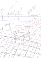
 Activity Two: Perspective


Activity Three: Using a Graphics tablet to draw a real-life object
The Style and Purpose of Four Chosen Concept Art


Concept art has many purposes; it allows someone to show a visual representation of any ideas they have so that it is easy for people to visualise for themselves. People imagine things differently but concept art means that everyone can see the same thing and work on the same idea. Also when creating concept art, it allows people to tell a story, whether it is a story line for a film, or just the story of how a character came to be. 


Creature -


This image is an adaptation of one of the characters called Metapod in the Pokemon anime series. I chose this image because it is an amazing interpretation and rehash of something very familiar and non-realistic and it has made this character come to life and gives the idea of what it could look like if it were real and 3D. The artwork is very eye catching because of the bright colours used and the style used to create it. This character is insect based and the artist has made it look very grotesque with the choice of colours and the use of line and shape. Insects are seen to be both very different and alien to humans, which may be why the artist has portrayed this character in this way.


The style it has been created in is similar to the work of Carlos Huante whose work is shown to the left. The image is of an adapted humanoid and as you can see it is very grotesque and bulbous and appears as if it has growths all over its body. The bumps combined with the unnatural red of the skin makes it look very alien, just as the Metapod has various bumps on it and has a bright unnatural colour. 


The Metapod also bares a very strong resemblance to the electromechanical head of the Alien drone within the Alien franchise, both baring a very similar structure and curvature. Along with this the tubing along the side of the head gives a relatively same impression of the segmentation at the abdomen of the Metapod.


Environment:


This is concept art for a place than someone has imagined. The image is very eye catching because of the contrasts within the piece. There is a big contrast between the structures and the bright sky in the distance and between the bright red grounds. The image gives the feel that it is a deserted place and that it is a bit sinister. 


The structures in the image resemble those of stalagmites as they are uneven and are thinner at the top than they are at the bottom. They also resemble termite mounds in that respect, and because termite mounds are full of life, it could mean that the structures in the image are full with colonies as well meaning that it is a city.
 This image is concept art taken from the Return of the King by Gary Russel. It resembles the image in that the colours are very similar with the dark structures and the light sky in the distance, and it also has red highlighting main points in the image. This style is very similar as well in which the structure is the main focal point next to that of the dragon.


-